“Users struggle with boring, banking-style wallets—Ghostly aims to introduce delight and ease without losing trust.”

As you can see, sketching isn’t exactly my forte — but that’s not the point. The goal here was to create something more enjoyable.
Here’s my caveat: Crypto — especially Web3 — is business in pajamas.
Yes, we’re talking about money. But 90% of wallet UIs look like they came straight out of a traditional bank — clean, bright, and painfully serious. That’s where we lose a key part of Web3’s spirit.
Yes, we’re talking about money. But 90% of wallet UIs look like they came straight out of a traditional bank — clean, bright, and painfully serious. That’s where we lose a key part of Web3’s spirit.
Crypto should feel different. It should be expressive, playful, even weird.
Some of the biggest decisions in Web3 are made in a basement, mid-game, during a Discord call. It’s not Wall Street — it’s something else entirely. And our interfaces should reflect that.
Some of the biggest decisions in Web3 are made in a basement, mid-game, during a Discord call. It’s not Wall Street — it’s something else entirely. And our interfaces should reflect that.

The Problem
The Degen of Today Is the Wall Street of Tomorrow
— With more hair and fewer heartburns.
Business-as-usual is dying. Ten years ago, Bitcoin was the punchline of every boardroom joke. Now? Some of those same institutions are eyeing $PEPE as mortgage collateral.
Of course, great UX is essential — no one wants to fumble their money. But it’s not just about buttons and flows. The real killer for most “next-gen” crypto apps? A complete lack of authenticity.
People don’t come to Web3 to feel like they’re logging into Chase. They come for ownership, culture, and chaos — and our interfaces should reflect that. If your product looks like a bank with nicer gradients, you’ve already missed the point.
But even chaos needs clarity.
Through user interviews and personal experience, I noticed that most people abandon Web3 wallets before they even get started. I spoke with five crypto-curious users and identified three recurring friction points:
Unclear seed phrase flow — too technical, too fast
Anxiety about losing funds — no sense of safety
Confusing interfaces — too many tokens, tabs, and terms
Ghostly Wallet was born from this tension: how can we embrace the culture of Web3 while simplifying the experience?
Design Process & Decisions
The color palette for Ghostly balances playfulness with trust. I chose soft purples, misty grays, and gentle gradients to reflect the wallet’s spectral theme — light, ethereal, and a bit mischievous. These tones create a calming contrast to the harsh, high-saturation visuals typical in many Web3 apps.
Accessibility was key: all primary actions meet contrast guidelines, while secondary and background colors help guide attention without overwhelming the user. The palette also supports dark mode natively, ensuring clarity and comfort during longer interactions.
This isn’t neon DeFi chaos — it’s thoughtful, spectral calm. Web3 doesn’t have to scream to stand out.

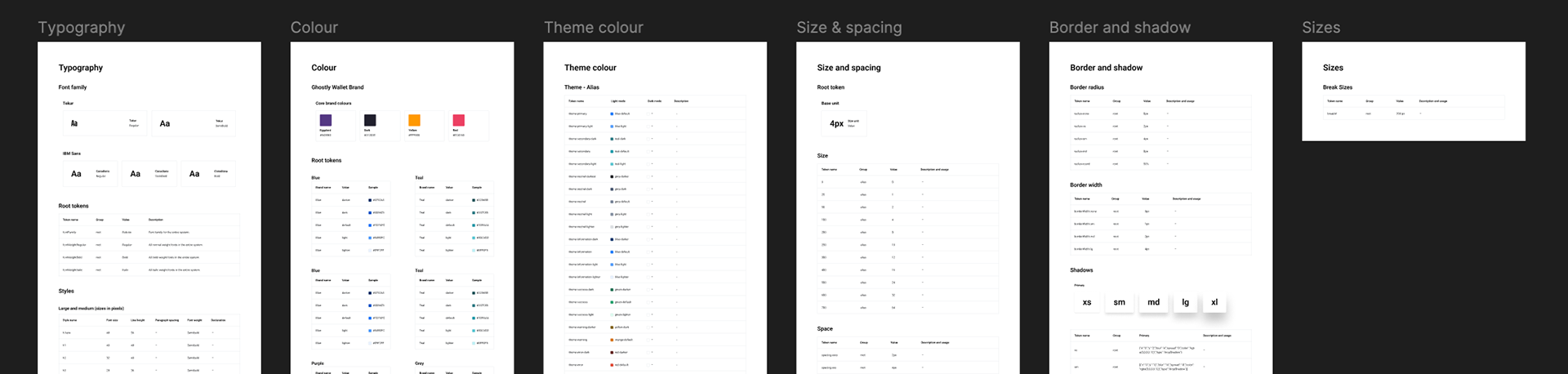
To support Ghostly’s consistency and scalability, I explored two distinct approaches to the design system.
First, I built a traditional set of style guidelines — including typography, spacing rules, color tokens, and reusable components. This ensured strong visual consistency and alignment across the UI.
Then, I took it further by experimenting with Supernova, transforming the static system into a more dynamic, workflow-driven tool. This allowed for token-based design decisions and potential future integration with code, bridging the gap between design and development.
This dual approach let me evaluate both foundational clarity and future-ready workflows, aligning Ghostly not just with today’s needs, but with the systems-thinking required for real product teams.
Colour approach
Instead of relying on a noisy color explosion (like many Web3 interfaces do), Ghostly uses a monochromatic approach centered around the core theme color — soft purples and spectral neutrals. This reinforces the brand’s tone: mysterious, calm, and focused.
Rather than using multiple colors to signal interaction, I introduced visual contrast through size and hierarchy. Primary actions stand out through scale and positioning, not just brightness. Buttons vary in size based on priority, and interactive elements are spaced with intention to guide the user’s flow naturally.
This approach keeps the interface clean, immersive, and accessible — proving that even in crypto, less can be more.
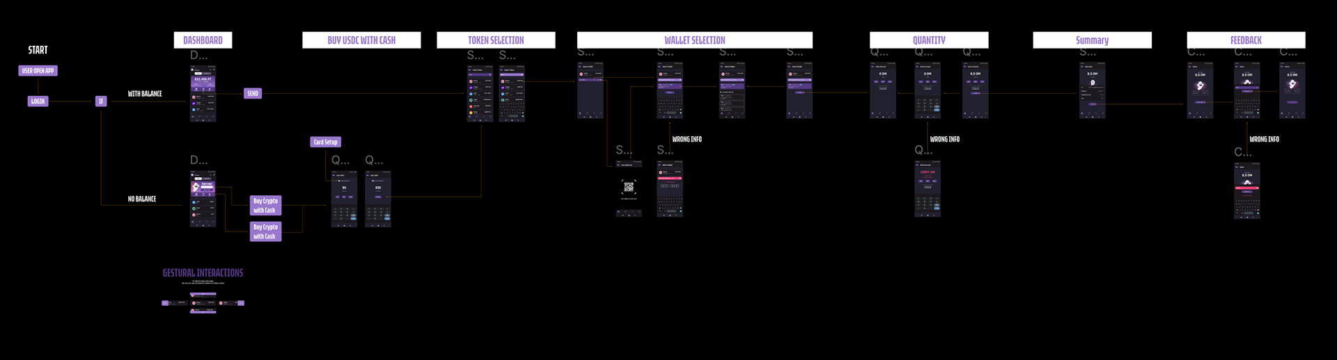
Interaction Flow: Withdrawing, Simplified
Crypto transactions often feel like filling out tax forms — intimidating, opaque, and easy to mess up. With Ghostly Wallet, I reimagined the withdraw flow as a clear, linear story, reducing anxiety and cognitive load.
The logic is conversational:
"I want to send this token → to that wallet → using this network → with this amount → I review and confirm."
Each step is presented in bite-sized screens, with friendly copy and smart defaults that reduce friction. On the review screen, users can edit anything in-line before confirming, eliminating the need to start over.
This flow prioritizes:
→ Clarity over complexity
→ Confidence over confusion
→ Storytelling over forms
Because sending tokens shouldn’t feel like launching a rocket — it should feel like sending a message.
Final UI
The final interface brings together everything Ghostly stands for — lightweight, intuitive, and playful without being gimmicky.
The screens are built on a responsive grid, with thoughtful spacing and minimalist typography that adapts effortlessly to mobile environments. Ghostly’s soft monochromatic palette, combined with spacious layouts and clean iconography, creates a calm atmosphere that invites exploration instead of overwhelm.
Micro-interactions add delight without distraction, from hover states that respond gently, to ghost-like transitions that reinforce the brand’s spectral tone. Key elements like balances, actions, and alerts are emphasized through scale, not color, aligning with the wallet’s core philosophy of simplicity and focus.
This isn’t just a UI for Web3 power users — it’s designed for the crypto-curious, the cautious, and the chaos-seekers alike.

This is an ongoing project; more will be added soon!