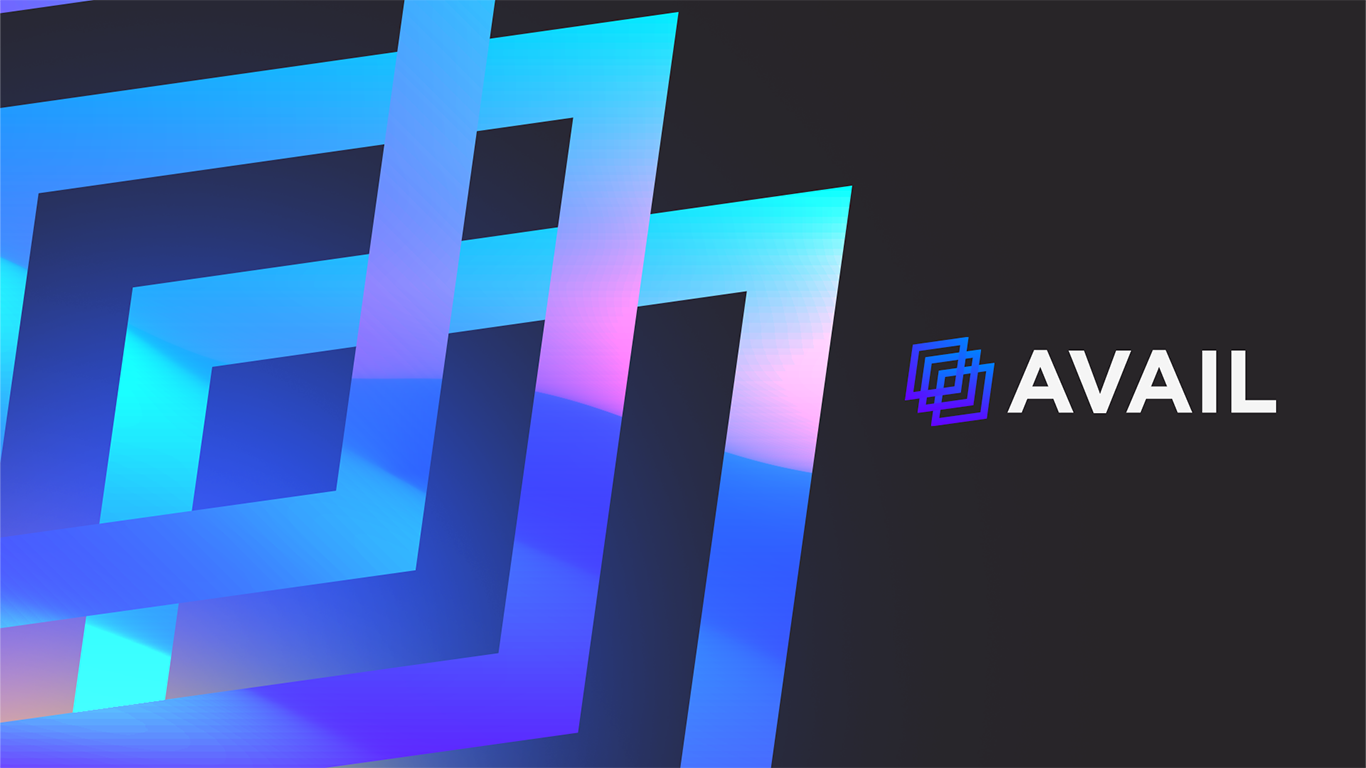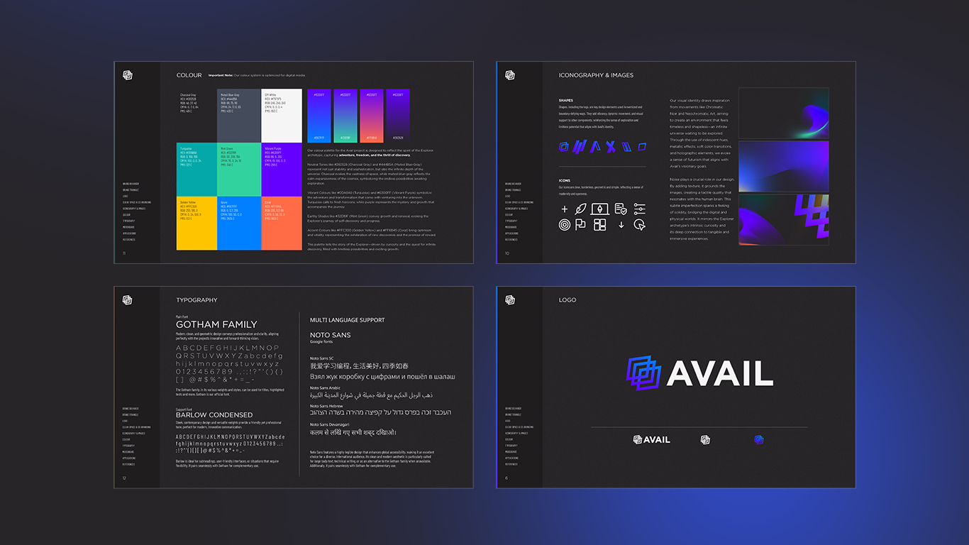
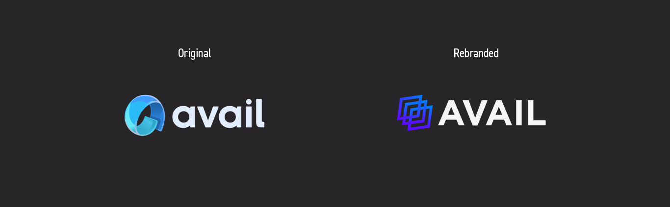
The logo concept was built around a simple yet meaningful idea: Avail’s system operates with three distinct layers of information—each representing a unique feature of the blockchain. This inspired a geometric logo that reflects structure, depth, and modularity.
The typography was also significantly improved: we moved from the passivity of a lowercase wordmark to the bold impact of an all-uppercase typeface. The original icon lacked emotional value and delivered no clear message—something we intentionally corrected with a design that now communicates strength, clarity, and technological sophistication.